


This was my original mock up for the digipak (CD not vinyl) but I soon realised that due to external issues it would be impossible to have the bottom left image of all the characters and so I changed to the stop sign with a moustache.

PLANNING
Analysis of existing digipak of the same genre

The album cover is a CPR mannequin immediately connoting the meaning of the album itself as the key track is "My iron lung". Also the distortion of the image making it appear as if on a monitor highlights the false expectations highlighted throughout tracks on the album.
The inside of the CD Cover continues the orange and red themes of the bold title in a more abstract way. This continuation of the colours calls the viewers attention strongly and also allows for more freedom of the artiststo later incorporate thos closers into the music video.
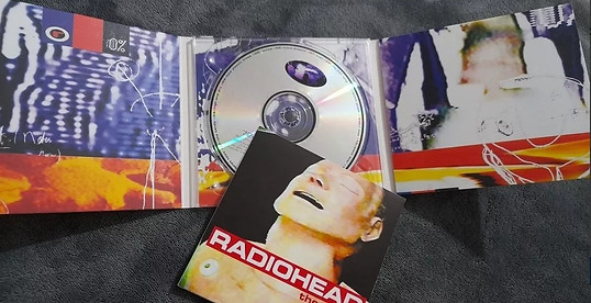

Here is the back two covers of the CD cover and I really like the manipulation of colour and the grid images as it really adds to the grimy, indie setting of their genre. Also the use of the back cover for text in this case being the songs on the album is something I plan to implement in my back cover but with the lyrics of the song to make it more interactive.